Developing a consistent brand starts with creating a brand style guide. These branding rule books help graphic designers, marketers, web developers, community managers, and even product packaging departments all stay on the same page, and present a unified vision of the brand to the public.
The best brands stick in our brains because their presence is defined by the repetition of the same logo, fonts, colors, and images. Once we see them enough, they become instantly recognizable, bringing us a clear sense of reliability and security. All of this is possible when each member of your team adheres to a cohesive brand style guide.
In this article, we’ll go over what brand guidelines are, the elements of a style guide, and some amazing examples of them in action to use as inspiration for your next branding project or website redesign.
What are brand guidelines?
Brand guidelines, also known as a brand style guide, govern the composition, design, and general look-and-feel of a company’s branding. Brand guidelines can dictate the content of a logo, blog, website, advertisement, and similar marketing collateral.
Picture the most recognizable brands you can think of. Chances are, you’ve learned to recognize them because of the consistency across the messaging — written or visual — these brands broadcast. The same brand colors are reflected across them. The language sounds familiar. It’s all very organized and, while not rigid, it’s cohesive.
Even if you work at a small company, you can also create a brand style guide that takes your company’s visual identity to the next level. But before you sit down to create your branding guidelines, it’s essential to take a step back and define your brand’s mission statement and buyer personas.
These strategic elements will help you dive into the tactical components of your brand style guide later.
Brand Guidelines Mission Statement
Your mission statement is an action-oriented statement declaring your organization’s purpose, making it the compass of your brand style guide. It ensures that all your content is working toward the same goal and connecting with your audience. This statement can guide your blog and paid content, ad copy, visual media, and slogan.
You can either include your mission statement within your style guide, create a separate document that you can reference during the creation process, or distill your mission statement into a slogan that you can place at the head of your document.

Brand Guidelines Buyer Persona
A buyer persona is a fictional representation of your ideal customer. It includes details on your customer’s job title, age, gender, and professional challenges — therefore stipulating for whom your brand publishes content.
Your buyer persona guides your blog content, ad copy, and visual media, which can attract valuable leads and customers to your business.
Download our free resource on how to create your own style guide with brand guidelines templates to follow. Creating a consistent style guide isn’t easy, but with these tools you can build an unforgettable one with ease.
Next, we’ll go over a few elements you’d find in a brand style guide and which parts of a brand they can influence.
Download our free resource on how to create your own style guide with brand guidelines templates to follow. Creating a consistent style guide isn’t easy, but with these tools you can build an unforgettable one with ease.
The Elements of a Brand Style Guide
A brand style guide encompasses much more than just a logo (although that’s important, too). It visually encompasses everything your brand is about — down to your business’ purpose. Here are some key elements that make or break a brand style guide.
Logo
Your logo might seem like the simplest aspect of your branding guidelines, but in reality, it’s one of the most complex and most important parts.
In your guide, you should include a visual of your logo, explain its design details, and describe how it can be used by external and internal publishers (with or without your brand symbol, for instance, or with certain spacing requirements).

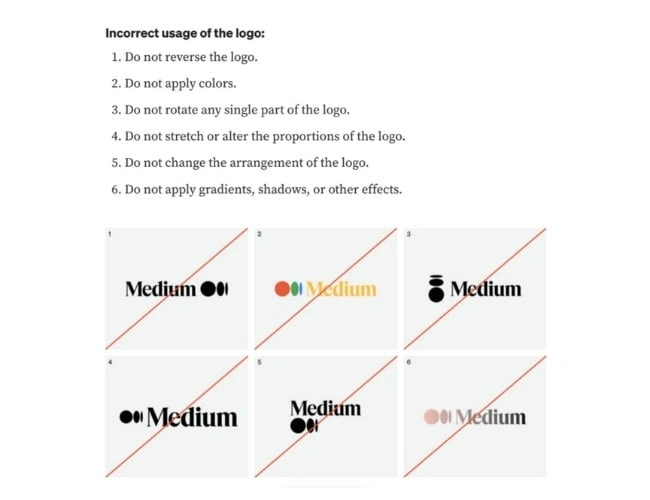
You should also include wrong usages — i.e, you might advise against rotating the design or curving the font. That way, whether you or someone else is publishing information about your company, your logo looks consistent everywhere.
If your brand is well-known and many outlets publish information about you, you might want to provide an entire document outlining acceptable use policies for your logo.

Color Palette
The color palette is probably one of the most distinctive and recognizable parts of a company’s branding guidelines. It’s the group of colors your company uses to design its brand assets, guiding every piece of visual content created. These color combinations often follow HEX or RGB color codes, and govern your logo, web design, printed ads, and event collateral.

A brand color palette should not only include your primary color, but also a wide variety of secondary, tertiary, and neutral colors. This will allow you to come up with more dynamic and varied designs in the content creation stage. If you don’t define an array of options, you can run the risk of having your team create content with random secondary colors, which can look inconsistent.
Typography
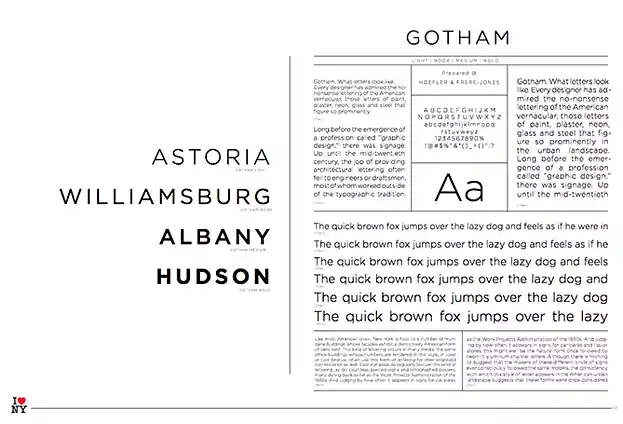
Typography is a visual element of your brand style guide that goes beyond the font you use in your company logo. It supports your brand’s design down to the links and copy on your website — even your tagline. We recommend specifying a primary and secondary font, with a mixture of serifs and font weights for different use cases.
Remember, the goal of your branding guidelines is to empower your people and external stakeholders to create consistent but varied collateral on behalf of your brand. You don’t want to limit them with a single font option.
For instance, HubSpot’s primary font is Lexend Deca (sans-serif), while our secondary font is Queens (serif). They’re both integrated in our team’s CMS, CMS Hub, and our design tool, Canva, where we can use a wide variety of font weights to create assets. 
Don’t forget: Typography plays a major role in your website’s user experience, so you want to make sure it is visually appealing while also being accessible and easy to read.
Imagery and Iconography
You may be able to only include your logo, colors, and fonts in your guidelines, but if you’d like to create a stronger style guide, consider including approved imagery, pre-designed icons, and custom symbols for your company to use across your website and print collateral.
If your budget is smaller, you can recommend photographic styles (i.e candid versus staged, etcetera), and then direct content creators to your preferred stock photo provider (i.e. Shutterstock, Unsplash). Alternatively, you can commission a company photoshoot at a studio and make the resulting photography available for creative use.

Symbols and icons can also be a great addition to your branding guidelines. As with photos, you can always find free icons online and recommend what to use versus what not to use — for instance, you might prefer to use outline icons only, and not full-color. You can also commission custom icons from a freelance graphic designer.
Brand Voice
If your company visuals are the flesh and bones of your style guide, your brand voice is the beating heart.

The importance of your brand voice can’t be overstated. Whether you want your company’s personality to be friendly and casual, or distant and formal, you want to make it easy for marketers, salespeople, and content creators on your team to know how to represent your brand online. This will ensure consistent messaging across all channels.
You can also include a full editorial style guide. The job of an editorial style guide is to commit an editorial stylebook on how to phrase certain products, list topics the brand can and cannot write about, and other companies it can mention. Your editorial style guide can guide your blog content, video scripts, website and landing page copy, PR talking points, and knowledge base articles.
As you can see, the purpose of the brand style guide is to form and maintain all of the various elements of a company that, when combined, spell out the entire brand as it’s recognized.
Intrigued? Check out 21 of the best ones we could find.
Style Guide Examples
- Medium
- Walmart
- Asana
- Skype
- Barre & Soul
- Spotify
- Starbucks
- Paris 2024
- Urban Outfitters
- Love to Ride
- Barbican
- I Love New York
- TikTok
- University of the Arts Helsinki
- Ivy Lane Events
- Western Athletic Conference
- Discord
- Netflix
- Scrimshaw Coffee
- NASA
- New York City Transit Authority
1. Medium
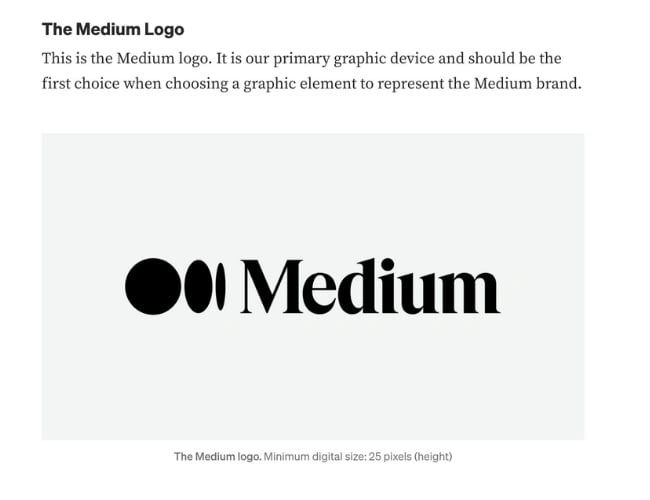
Medium simple brand style guide emphasizes usage of its logo, wordmark, and symbol. Medium’s logo is the brand’s primary graphic element and was created to feel “confident, premium, timeless, and modern.”
See the full brand guide here.
2. Walmart
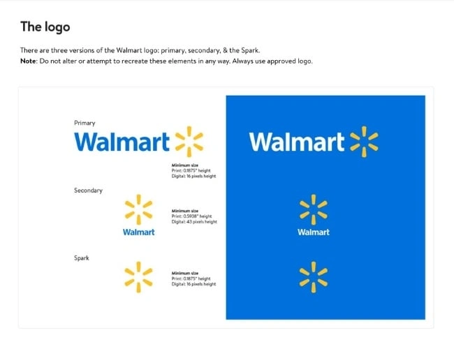
Walmart is one of the world’s largest and most recognizable brands, so it’s no surprise that its brand guide is extremely thorough.
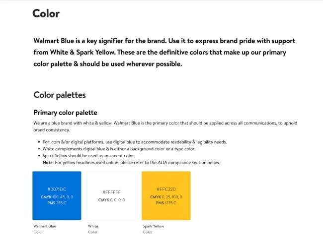
The guide includes the brand’s logo, photography, typography, illustrations, iconography, voice, editorial style, and more. Walmart’s color palette is so integral to its brand identity that its primary color is called “Walmart Blue.”
See the full brand guide here.
3. Asana
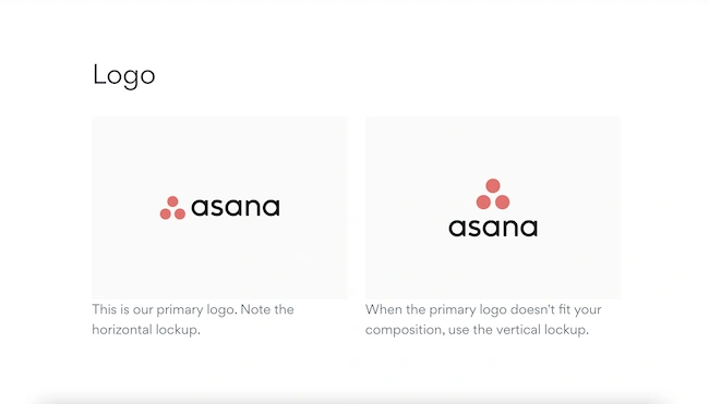
Asana’s simple style guide highlights its logo and color palette. It also explains how to properly use the brand’s assets.
See the full brand guide here.
4. Skype
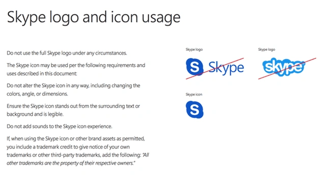
Everyone’s favorite video chat platform also has a squeaky-clean style guide for its brand. Skype, now owned by Microsoft, focuses primarily on its product phrasing and logo placement.
See the full brand guide here.
5. Barre & Soul
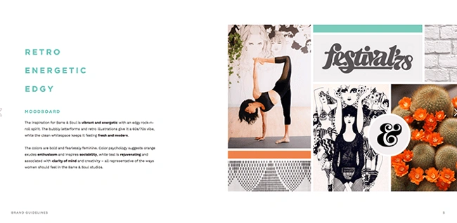
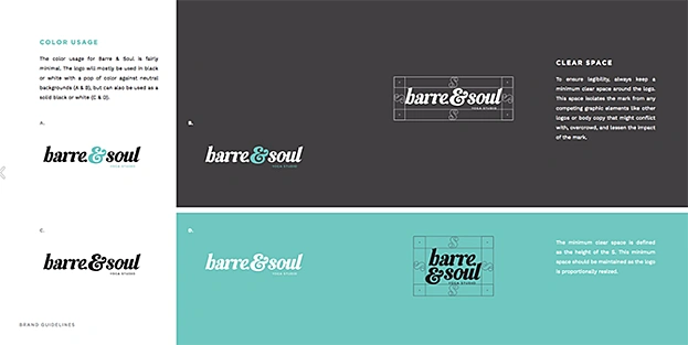
Barre & Soul’s brand style guide includes variations of its logo, logo spacing, secondary logos, supporting imagery, and a five-color color palette.
See the full brand guide here.
6. Spotify
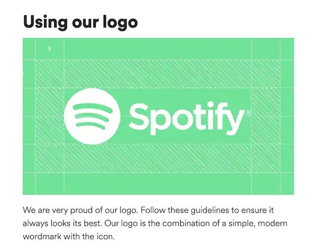
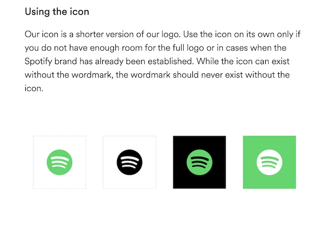
Spotify’s style guide might appear simple and green, but there’s more to the brand than just a lime green circle. Spotify’s color palette includes three color codes, while the rest of the company’s branding guidelines focus heavily on logo variation and album artwork.
The style guide even allows you to download an icon version of its logo, making it easier to represent the company without manually recreating it.
See the full brand guide here.
7. Starbucks
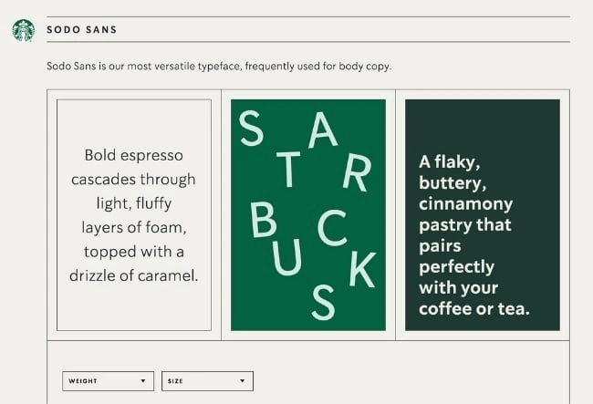
Starbucks’ interactive brand style guide includes details about how to use its core elements such as the iconic Siren logo and green color palette.
Plus, the guide features a visual spectrum of how their creative assets can be used across different channels as well as case studies of different seasonal campaigns and product launches.
See the full brand guide here.
8. Paris 2024
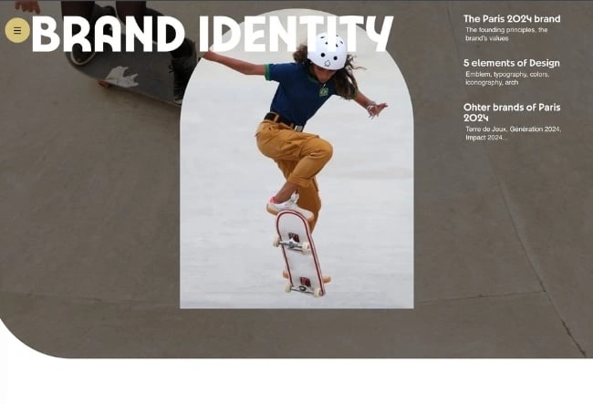
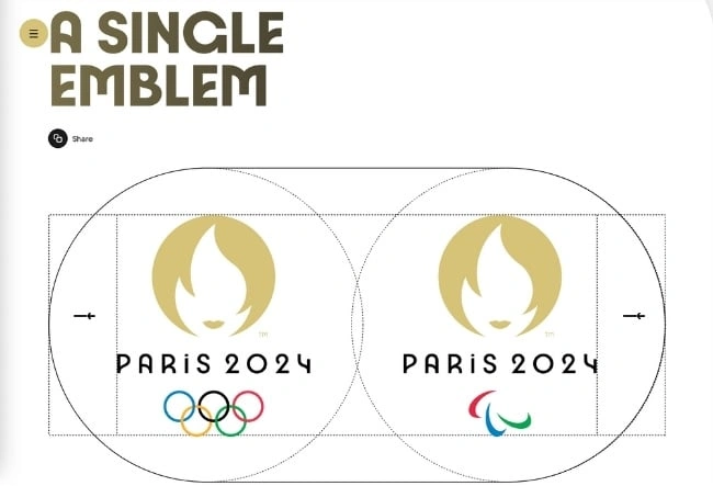
Paris 2024’s brand identity pays homage to the 1924 Olympic Games through Art Deco inspired design. The iconic emblem, color scheme, typeface, and iconography are all detailed in its brand guide. Best of all, designers applied eco-branding methods to Paris 2024’s brand materials to reduce the amount of ink and paper needed for physical materials as well as limit the power and data consumption on digital elements.
See the full brand guide here.
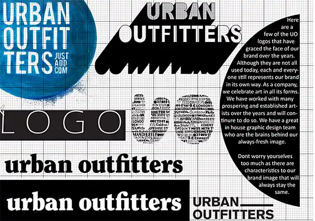
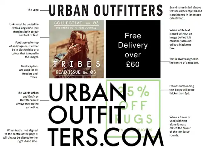
9. Urban Outfitters
Photography, color, and even tone of voice appear in Urban Outfitters’ California-inspired brand guidelines. However, the company isn’t shy to include information about its ideal consumer and what the brand believes in, as well.
See the full brand guide here.
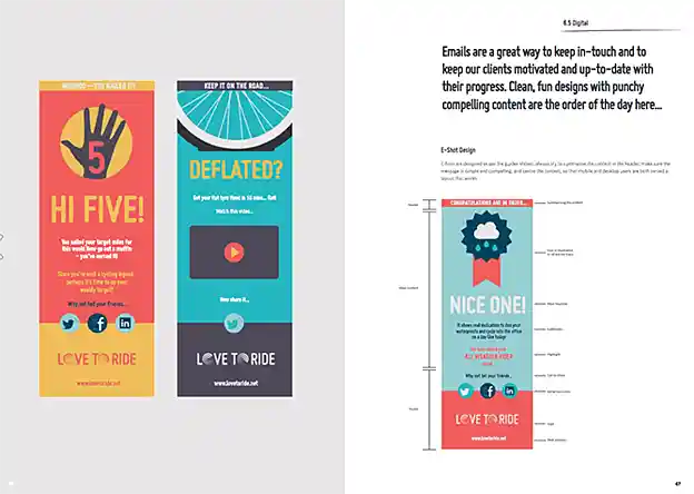
10. Love to Ride
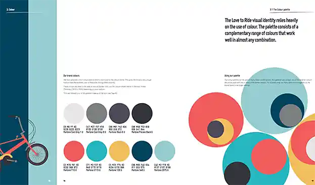
Love to Ride, a cycling company, is all about color variety in its visually pleasing style guide. The company’s brand guidelines include nine color codes and tons of detail about its secondary logos and imagery.
See the full brand guide here.
11. Barbican
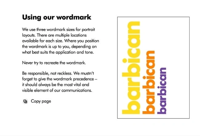
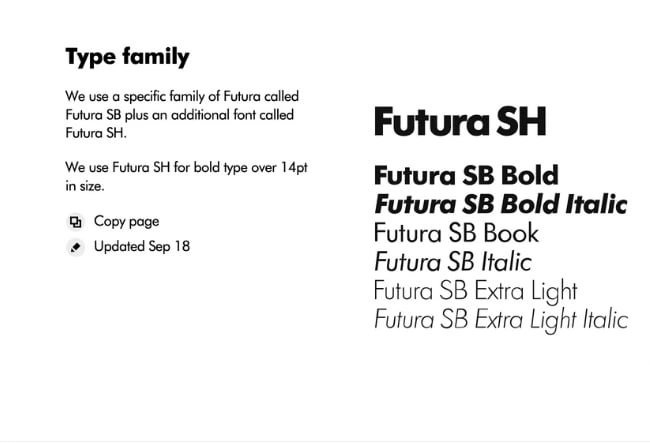
Barbican, an art and learning center in the United Kingdom, sports a loud yet simple style guide focusing heavily on its logo and supporting typefaces.
See the full brand guide here.
12. I Love New York
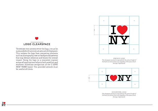
Despite its famously simple t-shirts, I Love New York has a brand style guide. The company begins its guidelines with a thorough explanation of its mission, vision, story, target audience, and tone of voice. Only then does the style guide delve into its logo positioning on various merchandise.
See the full brand guide here.
13. TikTok
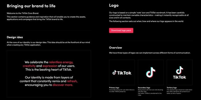
TikTok’s style guide isn’t just a guide — it’s an interactive brand book. First, it provides an in-depth look into how it brings its brand to life through design. Then, it gives an overview of its logo, co-branding, color, and typography. At its core, TikTok is a brand that “celebrates the relentless energy, creativity, and expression of [its] users.”
See the full brand guide here.
14. University of the Arts Helsinki
The style guide of the University of the Arts Helsinki is more of a creative branding album than a traditional marketing guide. It shows you dozens of contexts in which you’d see this school’s provocative logo, including animations.
See the full brand guide here.


15. Ivy Lane Events
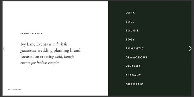
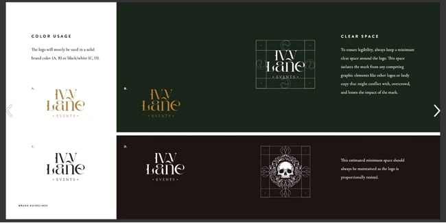
Ivy Lane Events’ bold style guide is reflective of the edgy events the company produces. In it, you’ll find a mood board with dark, romantic visuals inspired by “victorian gothic style and vintage book art.” The guide also details the proper usage design elements such as the wordmark, primary icon, secondary logos, color, and typography.
See the full brand guide here.
16. Western Athletic Conference
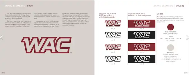
The Western Athletic Conference’s brand style guide includes extensive information about its history, mission, and vision. It also highlights its member universities and athletic championships and awards it is involved with. The brand elements include logo, colors, slogan, patch, and more.
See the full brand guide here.
17. Discord
Discord’s brand guide is as colorful and playful as the communities it serves. The brand’s motion elements are based on the dot, which represents the Discord user interacting with others in the communities it belongs to. The guide describes usage of Discord’s typography, colors, and icon (lovingly named Clyde).
See the full brand guide here.

18. Netflix
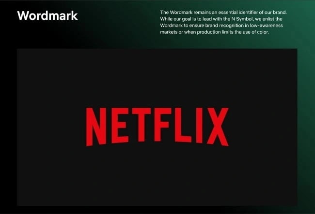
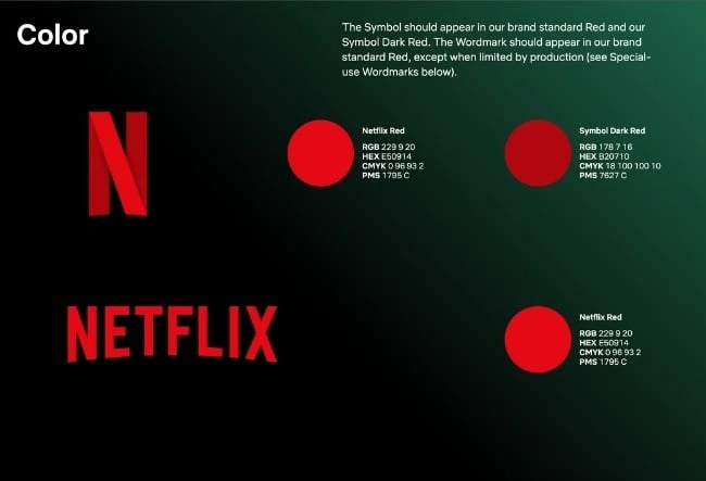
As far as its public brand assets are concerned, Netflix is focused primarily on the treatment of its logo. The company offers a simple set of rules governing the size, spacing, and placement of its famous capitalized typeface, as well as a single color code for its classic red logo.
See the full brand guide here.
19. Scrimshaw Coffee
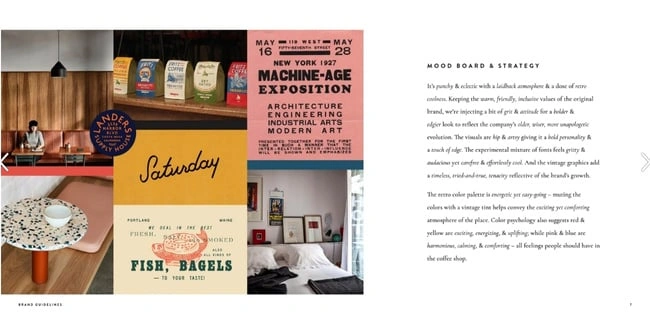
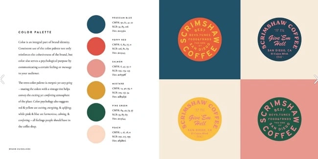
Featuring a six-code color palette, this “laid back,” “cool,” and “eclectic” brand has a number of secondary logos it embraces in various situations.
See the full brand guide here.
20. NASA
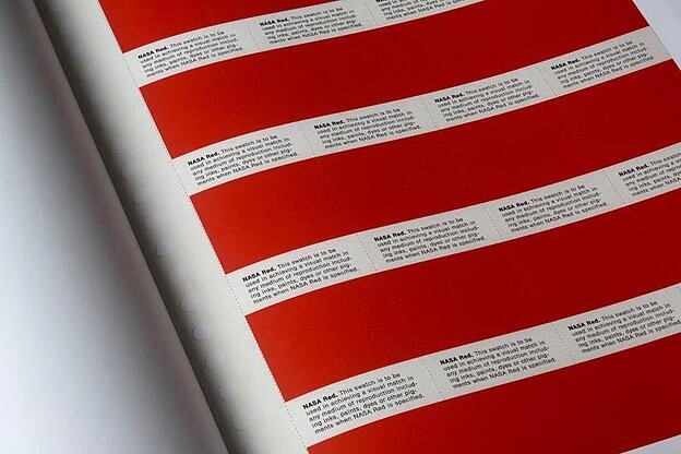
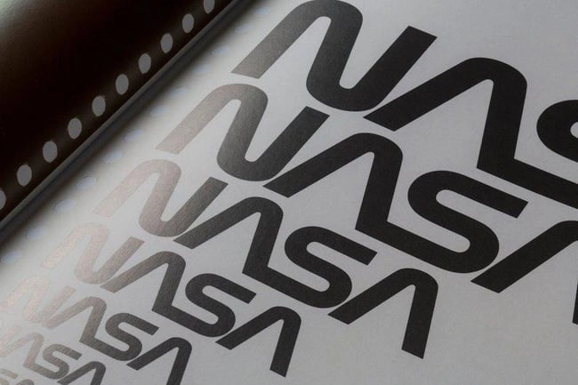
NASA’s “Graphics Standards Manual” is as official and complex as you think it is. At 220 pages, the guide describes countless logo placements, color uses, and supporting designs. And yes, NASA’s space shuttles have their own branding rules.
See the full brand guide here.
21. New York City Transit Authority
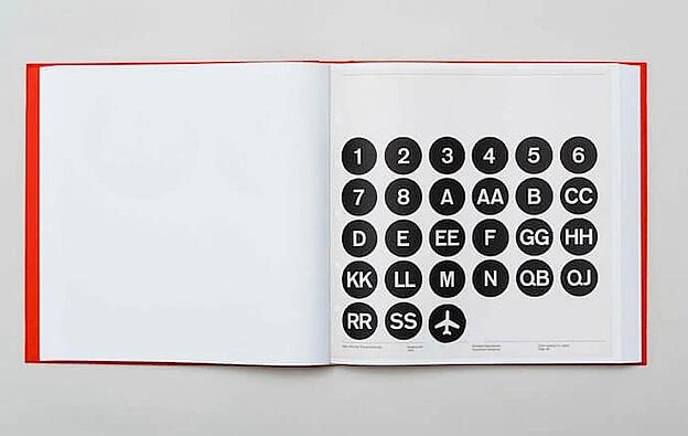
Like NASA, the NYCTA has its own Graphics Standards Manual, and it includes some fascinating typography rules for the numbers, arrows, and public transit symbols the average commuter takes for granted every day.
See the full brand guide here.

Branding Guidelines Tips
If you want to take your branding style guide to the next level, I recommend following these best practices, which the HubSpot Creative team has used to disseminate branding information to the rest of the HubSpot Marketing team.
This has not only made my job as a blogger easier, but also makes our branding feel well thought-out and cohesive.
1. Make your guidelines a branded document.
Whether you’re publishing your branding guidelines online or creating an internal presentation, consider making the guidelines themselves a branded document. Ensure the published document follows your established brand voice, uses the symbols and imagery you’ve created, and employs the colors and typography that makes your brand feel like you.
When our Creative team rolled out a visual identity refresh for the HubSpot brand, we all received access to a branded playbook that summarized all the changes and described how we should represent HubSpot online moving forward. Not only was I a huge fan of the refresh, but also of the way it was presented to our team in a branded document.
You can do the same, regardless of your budget. Our Creative team actually used a free tool, Google Slides — so it’s totally doable for a small or freelance brand!
2. Name your brand’s colors.
You’ve already chosen your color palette — why go as far as naming the colors? Giving your colors unique names (aside from “blue” or “orange”) can help you tie the tactical elements of your branding into an overall theme or ethos.
Not to mention that it’s awesome to be able to refer to company colors by a unique name. Imagine if we called Solaris, HubSpot’s primary brand color, “HubSpot Orange” — that simply doesn’t have the same ring.
In our visual identity refresh, our Creative team brightened and intensified our color palette, then renamed the individual hues. They wrote, “Every color, tint, and shade is based on central themes. […] Whether it’s a subway line in Paris, or a flower-lined street in Japan, the secondary color names are a veritable tour of important cultural and geographical touchstones from HubSpotters all over the world.”
Think about what makes your brand unique, and why you chose the colors that you did. For instance, if you work at a law firm that specializes in car accident cases, you might choose red as one of the brand colors and call it “Stop Light.”
3. Create easy-to-use branded templates.

Alongside your branding guidelines should be templates to empower your team to easily design branded assets, even if they’re not designers. At HubSpot, we keep all of our templates in our team’s Canva account. There, anyone (myself included) can edit pre-made designs for any number of use cases.
As a writer on the HubSpot blog, I have to create graphics to supplement the information I’m sharing. The branded templates made by our Creative team have made my work a great deal easier — and I can imagine that it’s the same for our Social Media team, when they need to publish an update on any one of HubSpot’s social media profiles.
Whether you run a small or large business, you can benefit from creating at least one template that could be adjusted to different sizes. Not everyone is a designer, but with templates, you can ensure your brand looks professional no matter who creates an asset.
4. Ensure your branding is optimized for all channels.

Your branding guidelines should include different specifications for different channels — or, alternatively, you should have assets and designs that can be adjusted for various channels and mediums. Not only for sizing purposes, but for accessibility purposes, too.
For instance, if you primarily market your brand over Instagram and on your website, then your branding should have web accessible colors, as well as Instagram-friendly designs and sizes. On Instagram, you might want to avoid small, light typography, and so your font should work well for that channel, too.
You don’t want to significantly change your branding from channel to channel; it should work relatively well no matter where you’re marketing your brand.
Build a Memorable Style Guide of Your Own
Once you build your unique brand style guide, customers will recognize your brand and associate it with all the visual cues you want them to. We hope you were inspired by our list of amazing brand style guides and wish you luck in creating a timeless style of your own.
Editor’s note: This post was originally published in January 2017 and has been updated for comprehensiveness.

![Free Download: How to Create a Style Guide [+ Free Templates]](https://no-cache.hubspot.com/cta/default/53/76520ae5-1a3b-4055-9e8e-95e150b90965.png)
