While email marketing may not get the attention some newer marketing channels get, it’s still a terrific way to generate leads and convert more prospects for your business.
With that in mind, I want to share some email marketing best practices you can use to generate more leads for your business.
Email Marketing Best Practices
Email Marketing Metrics and Testing
Email Marketing Best Practices
- Email formatting
- Email Automation
- Email Marketing Metrics and Testing
Below are different best practices to remember at various points of your email marketing campaign.
Email Formatting Best Practices
When formatting your emails, make sure to:
Avoid using ‘No-Reply’ in the sender’s email address.
Have you heard of CAN-SPAM? This longstanding piece of legislation is a popular and important guideline for all email marketers in the U.S.
One major rule in CAN-SPAM is never to use the words “no reply,” or a similar phrase, as your email sender’s name (for example, “noreply@yourcompany.com”).
“No reply” in an email message prevents recipients from responding and even opting out of further emails, which CAN-SPAM protects their right to do so at any time.
Instead, have your automated emails come from a first name (for example, jamie@mycompany.com).
Your customers are much more likely to open emails if they know they were written by a human being, and it keeps you compliant with email regulations.
Stick to fewer than three typefaces.
The less clutter you have in your email, the more conversions you’ll get. Don’t junk up your email with more than two fonts or typefaces, as that can distract readers and ruin your email’s visual appeal.
In addition, you want to use web-safe fonts with sizes between 10-point and 12-point. This ensures your email will be legible on all readers and devices.
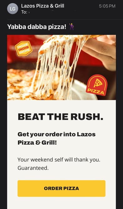
Check the email from Lazo’s Pizza as an example.
 What We Like: Each typeface is distinct enough to guide your eye, but similar enough that it’s not jarring to readers.
Optimize the email’s preview text.
If you subscribe to a newsletter, you’ve likely seen a message like this at the top of your email: “Email not displaying correctly? Click here.”

While it’s a helpful warning, keeping it in the preview text of your email can drastically impact your email’s open rate.
One reason is that you’re telling recipients, “Hey, this email might not work.” Another reason is it doesn’t provide any insight into what the email is about.
Your preview text should supplement your subject line by adding details to capture your audience’s attention and encourage them to open.
By default, preview text pulls in the first several words of the email body and displays it next to the subject line before the person opens it.
The problem is that custom email templates often stick with conditional statements like “Can’t see images?” or “Not displaying correctly?” at the top banner, allowing it to slip right into the preview when it goes out.
As a rule of thumb, always write a custom preheader that teases what your email will offer.
Pro-tip: HubSpot users can fix this problem by customizing the preview text themselves in the backend of their email marketing newsletter.
Include an email signature.
Your newsletter is technically being sent to your contacts on behalf of the company, rather than an individual. However, the email should include the signature of a specific person.
Email signatures add a touch of personalization. People are naturally more inclined to read an email if they know it came from a human being, not just a collective marketing team. Your email signature is your ticket to their attention.
Notice the email signature from the weight loss app Noom.
 What We Like: The email signature includes the person’s first name, their role within the organization, and a photo for a more human touch.
Want a quick way to make a beautiful email signature? Use HubSpot’s Email Signature Generator. We also have an Out-of-Office Email Generator to make your response to incoming messages just as delightful.
Keep the main message and call-to-action above the fold.
Above the fold refers to the information that’s visible to the reader before they scroll down.
Even though recent research suggests that consumers scroll more than they used to – because of social media and vertical timelines – above-the-fold content still gets the most attention.
Place your message and CTA above the fold. It’s the first thing your recipients will see once they open your email, therefore increasing your conversion rate.
You can also run an A/B test first to validate the hypothesis and see if it works for your emails.
Personalize the email greeting.
How often do you read emails that begin, “Dear Member”?
You might segment your email audiences by the type of customer they are (member, subscriber, user, etc.), but it shouldn’t be the first thing recipients see in your company messages.
Personalization is a major key to successful email marketing. In fact, 47.2{dba7cf0ad47ab1fe8fb56afab8625a63c119729bdcb3610dd520c9b91c38e48f} of marketers in a recent HubSpot survey listed personalization as one of the most effective email marketing strategies for reach their goals.
.png?width=530&height=277&name=Copy{dba7cf0ad47ab1fe8fb56afab8625a63c119729bdcb3610dd520c9b91c38e48f}20of{dba7cf0ad47ab1fe8fb56afab8625a63c119729bdcb3610dd520c9b91c38e48f}20Facebook{dba7cf0ad47ab1fe8fb56afab8625a63c119729bdcb3610dd520c9b91c38e48f}20Shared{dba7cf0ad47ab1fe8fb56afab8625a63c119729bdcb3610dd520c9b91c38e48f}20Link{dba7cf0ad47ab1fe8fb56afab8625a63c119729bdcb3610dd520c9b91c38e48f}20-{dba7cf0ad47ab1fe8fb56afab8625a63c119729bdcb3610dd520c9b91c38e48f}201200x628{dba7cf0ad47ab1fe8fb56afab8625a63c119729bdcb3610dd520c9b91c38e48f}20-{dba7cf0ad47ab1fe8fb56afab8625a63c119729bdcb3610dd520c9b91c38e48f}20Percentage{dba7cf0ad47ab1fe8fb56afab8625a63c119729bdcb3610dd520c9b91c38e48f}20+{dba7cf0ad47ab1fe8fb56afab8625a63c119729bdcb3610dd520c9b91c38e48f}20Copy{dba7cf0ad47ab1fe8fb56afab8625a63c119729bdcb3610dd520c9b91c38e48f}20-{dba7cf0ad47ab1fe8fb56afab8625a63c119729bdcb3610dd520c9b91c38e48f}20Dark{dba7cf0ad47ab1fe8fb56afab8625a63c119729bdcb3610dd520c9b91c38e48f}20(8).png) Personalizing the greeting of your emails with your contacts’ first names grabs the attention of each reader right away. For HubSpot users, this is called a personalization token, and creating one looks like this:
Personalizing the greeting of your emails with your contacts’ first names grabs the attention of each reader right away. For HubSpot users, this is called a personalization token, and creating one looks like this:

Then, the address line of your email would automatically produce the contact’s first name by fetching this personalization token in the email’s HTML, like this: Hi, !
Don’t worry, personalizing an email’s greeting line with 50 recipients’ names doesn’t mean you’ll have to manually write and send 50 different emails from now on.
Many email marketing tools today allow you to configure the greeting of your email campaign so that it automatically sends with the name of the people on your contact list – so everyone is getting a personal version of the same message.
Keep your email around 500 to 650 pixels wide.
If your email template is wider than 650 pixels, your email won’t show up correctly and will require users to scroll horizontally to read the full email.
This is a pain, to say the least, and will likely affect your conversion.
Having your template fit within the standard format will make for easier readability, better conversions, and an overall better user experience.
Include your logo.
Logos are a must when it comes to emails.
They establish legitimacy and trust, meaning the recipient will know the email is from a real brand, not a scam. Plus, like email signatures, they boost brand recognition.
This is because the logo is one of the first things the audience sees when they open their email.
With this in mind, add your logo to your email design to ensure that it’s always included.
Name the offer in your subject line.
When you include an incentive in your subject line, you can drastically increase your open rates.
“Free shipping when you spend $25 or more” and “Receive a free iPod with a demo” are examples of good, incentive-focused subject lines.
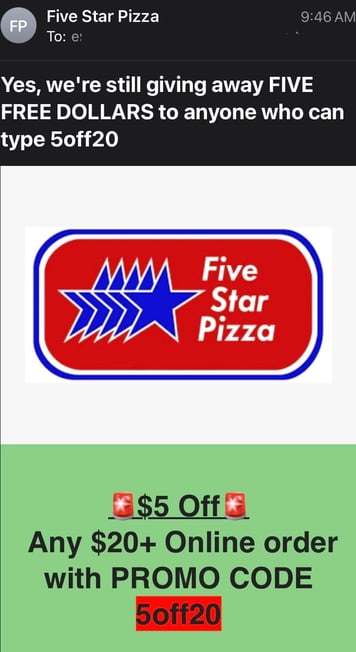
Another example comes from Five Star Pizza. The subject line for its email reads, “Yes, we’re still giving away FIVE FREE DOLLARS to anyone who can type 5off20.”

Pro Tip: While this is an eye-catching example, try to keep your subject lines short to avoid them getting cut off when first viewed in the recipient’s inbox. Keep subject lines between 9 and 60 characters.
If you’re struggling with email subject lines, HubSpot’s Campaign Assistant is a neat tool that can craft excellent and succinct subject line copy to capture the recipient’s attention.
Furthermore, we have many email marketing tools to help you ideate, design, and carry out a successful campaign.
Remember, don’t overwhelm your readers with savings- or product-related emails.
Customer loyalty starts with casual industry insights – only after nurturing should you start introducing offers. Here’s an example of an email with an enticing subject line and warm, welcoming body copy:

Write compelling (but concise) subject lines.
A good subject line should contain between 30 and 50 characters, including spaces. The reason why you do this is that email providers often cut off subject lines that go beyond this length.
Your email subject line should also create a sense of urgency while giving readers some indication of what to expect once they open the email.
Closely tie emails to landing pages.
Your landing page should match the email in terms of headline, copy, and content. The look and feel of your landing page should also match the email as consistency goes a long way toward a customer’s trust.
Just make sure you’re using tracking tools to see which emails and landing pages performed the best so you can keep sending what’s working.
Email Automation Best Practices
Be prepared for your readers to forget they opted in, so set up an auto-responder that reminds people they opted into your email database. The auto-responder should be sent out one day, five days, and 10 days after the person registers.
Each auto-responder email should also include additional content or bonus material to reward the reader for opting into the newsletter– or your readers might not feel they have enough incentive to actually opt-in.
Email Marketing Metrics and Testing
If you can’t seem to increase your email’s open and click-through rates, a couple of things might be wrong: You’re not emailing the right people (are you buying your contact list? See the first tip at the top of this blog post), or the content needs to be improved.
To start, focus on the latter, and conduct an A/B test.
A/B tests can be used to improve almost any of your digital marketing content. In an email, this test splits your recipients into two groups: Group A receives the regular newsletter, while Group B receives the newsletter with a specific variation.
This variation tests to see if your audience would be more or less likely to take an action based on that element.
HubSpot Marketing Hub users can conduct email A/B tests on anything from the subject line to the call-to-action (CTA) inside it.
For example, you might change the color of your CTA from red to green to see if your email’s clickthrough rate increases. If it does, the test indicates that you should change your emails’ CTA color to green from now on.
Another best practice is to conduct a 5-second test.
Send a copy of the email to a friend or business associate. Can they quickly tell what your call-to-action is? If so, you’re golden. If not, keep working.
Many new tools are at a marketer’s disposal that are getting attention these days. But email marketing has stood the test of time regarding its influence on your users.
This old, reliable, and faithful tool can really ensure you get the most out of your marketing initiatives.
Now that you know email marketing best practices, you’re to craft your next successful email marketing campaign.
Editor’s Note: This post was originally published in June 2019 and has been updated for comprehensiveness.

![→ Download Now: The Beginner's Guide to Email Marketing [Free Ebook]](https://no-cache.hubspot.com/cta/default/53/53e8428a-29a5-4225-a6ea-bca8ef991c19.png)
